
Two days ago we published nine fixes from a walk through a live league’s public site as a first-time visitor. The list had twenty items. This is the next five, and four of them are about phones, because that is where most fans read a league site and where the tables and headers were losing the most. The screenshots are again from the Yerevan Amateur Cup at evncup.bbstats.am, 390 px for the phone shots and 1366 px for the laptop. Everything here applies to every league on bbstats.
Table of Contents
- Quick Takeaways
- The Standings Lost the Column That Orders Them
- A Game Log You Can Read Sideways
- Sign-in Moves Into the Menu
- The Replay After the Recap
- “Compare with…”
- What Is Still on the List
- Frequently Asked Questions
- References
Quick Takeaways
| Change | What a visitor notices |
|---|---|
| Standings on phones | # / Team / G / W / L / P / +/- fit without scrolling; “All columns” brings back the rest. |
| Player game log | Date and Opponent stay put while the stats scroll; a swipe cue; Total and Avg rows at the bottom on every screen. |
| Phone header | Logo, language, menu. Fan sign-in and the Coach portal link are at the bottom of the menu. |
| Finished game with a video | Scoreboard and recap first; “Watch the replay” in a narrower card after the tabs. Live games keep the stream on top. |
| Compare | The button reads “Compare with…”; the compare page opens with the cursor on the second player. |
The Standings Lost the Column That Orders Them
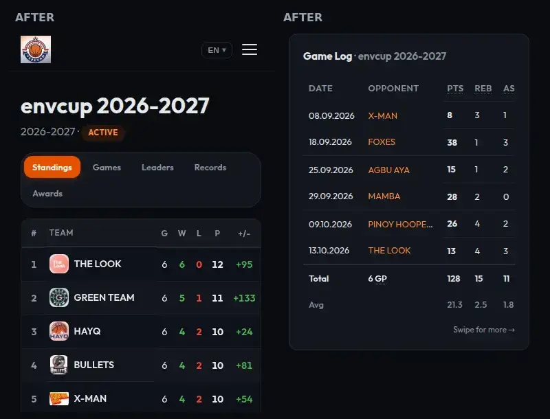
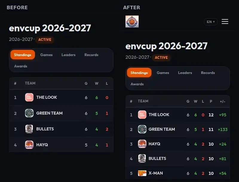
The standings table has thirteen columns. On a 390 px phone it scrolled sideways, and the visible part stopped after G / W / L. The column that actually decides the order, P for classification points, was off-screen to the right, as was the point difference that breaks ties. A visitor saw a team with 4 wins above a team with 4 wins and had no way to tell why without discovering the table scrolls.
On phones the table now shows # / Team / G / W / L / P / +/- and fits the screen without scrolling. Padding is tighter and long team names are trimmed with an ellipsis. Under the table a single button, All columns, brings back %, PTS, OPTS, PPG, OPPG and Streak, and the table scrolls as before while they are shown. Laptops and tablets wider than 720 px see all thirteen columns as they always did.
A Game Log You Can Read Sideways
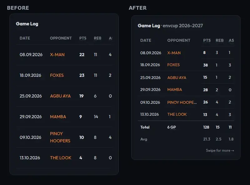
The game log on a player page is fifteen columns wide. On a phone it scrolled sideways with nothing to say so, and when you did scroll, the date and the opponent went with the rest, so halfway across you were looking at “26 · 4 · 2 · 9-13” with no idea which game it was. There was also no season line at the bottom; for totals you had to go back up to the averages card and do arithmetic.
Three changes:
- Date and Opponent are pinned on phones. The stat columns slide under them.
- A small “Swipe for more →” cue sits under the table on phones and fades out after the first swipe.
- The table ends with a Total row (games played, sums, made-attempted for field goals, threes and free throws, and the percentages) and an Avg row with per-game figures. Both follow the season selector, so they describe exactly the games listed. These rows are on every screen size, not only phones.
Sign-in Moves Into the Menu
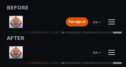
On a phone the header had four things: the league logo, an orange Fan sign-in pill, the language switcher and the menu button. The pill was the brightest element on every page, and most visitors never sign in; they come for a score or a table. It now lives at the bottom of the menu drawer, together with the Coach portal link on leagues that have the portal on. The header keeps the logo, the language switcher and the menu button. A fan who is signed in still sees their avatar in the bar, and nothing changes on screens wider than 640 px.
The Replay After the Recap
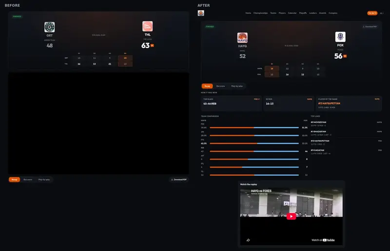
When a finished game had a YouTube link, the page opened on a full-width video. On a 1366 px laptop that was about 540 px of player before the scoreboard, and “How it was won” started below the first screen. For a game that is already over, the result and the recap are what most visitors came for; the video is the thing you open afterwards.
Finished games now open on the scoreboard, the quarter line and the tabs. The video sits in a Watch the replay card after the recap, box score or play-by-play, capped at 760 px wide on desktop and lazy-loaded. Live and scheduled games are not touched: there the stream stays at the top, because there it is the point of the page.
“Compare with…”
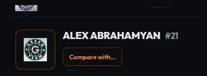
The small outlined button next to a player’s name read “Compare”. Compare what with what? It now reads Compare with…, and the Russian and Armenian labels say the same. The compare page it opens already has that player in the first slot, so the page now puts the cursor on the second dropdown as it loads. One tap, pick the second player, done.
What Is Still on the List
Fourteen of the original twenty items have shipped. Five are open: the Schedule Timeline on phones shows one day at a time; the calendar has two filters that look like the same championship dropdown; finished rows on the calendar do not look tappable; the home hero on phones crops a cover image that has its own text; and one API response carries more of the league record than a public page needs. They will appear in the changelog as they ship.
Frequently Asked Questions
Can I get the full standings table on my phone?
Yes. Tap All columns under the table. The table then scrolls sideways with all thirteen columns.
Do the Total and Avg rows include playoff games?
They include whatever the game log lists for the selected season, which is every game the player has a stat line in for that championship row.
Where is Fan sign-in now on my phone?
Open the menu (the three lines at the top right). The button is at the bottom, under the page links and social icons.
My league streams live games. Did the video move for those?
No. Only finished games put the video after the recap. Live and upcoming games keep it at the top.
Does any of this need a setting?
No. It is all in the public site every league shares.